10 Lessons from Rebranding a Design School
Check out Shillington’snew look and website! Read on to learn about our process.
Shillington’s visual identity has evolved a lot over the years—you could probably trace design trends year-by-year in our marketing materials. But our core identity is steadfast. Fundamentally, we’ve stuck to our same mission since day one: creating an inspirational environment for students to learn practical skills and graduate industry-ready to land their dream jobs.
Rebranding our design school was a unique challenge. Our existing look wasn’t broken, but didn’t have flexibility to let our content shine. We needed to develop a framework that stripped back to the design fundamentals—allowing us to showcase our amazing student stories and creative output. That’s what makes us stand out from the competition. That’s our difference. That’s our brand.
We decided to tackle the project from within. Here’s our story.
1. Run. Run as fast as you can.
All jokes aside, designing for designers is really tough. At Shillington, our leadership team is 100% designers and they’re a picky, opinionated bunch. From day one, we expected this process to be a roller coaster, but discovered that a team who understands design and design language starts ten steps ahead. We just had to develop and defend solid reasoning for all our decisions. And isn’t that how the creative process should always be?
2.Design school branding doesn’t need to win awards.
Our team kicked off the process with a frank discussion. No matter what, we had to resist the urge to make our new identity too trendy and cool. We had the talent and freedom to create something mind-blowing, but needed to remember our #1 audience. Prospective designers = non-designers. Our visual language has to be simple, direct and accessible… not edgy, gimmicky or trend-based.
3. Above all, be the brand.
At Shillington, we pride ourselves on a distinctly personal approach to education. Our teachers are direct, concise, fun and approachable. So, our brand should build on that. Plus, the proof is in our output. Happy graduates with amazing portfolios who get killer jobs.
We can rely on our output, as research shows. We conducted surveys with the design industry, incoming students and graduates who told us our most successful and relevant communications showcased testimonials and student work. This approach bridges the gap between study and industry and illustrates the success of our teaching methods. Our content—student work and graduate stories—are the core of who we are, and the brand grows from there.
4. Don’t just talk the talk, walk the walk.
Another key insight from our research uncovered a need to position ourselves as a respected authority in the design industry. We shouldn’t shy away from industry sceptics. We know our methods work.
These realisations guided a more holistic approach to the rebrand. Along with a visual makeover, we needed to introduce new Shillington initiatives. Our voice, stories and expertise should come first—it will only strengthen our brand. Here’s how we’re going to walk the walk, not just talk the talk:
- Launch the #Shillumni network. In conjunction with our rebrand, we’re formally announcing our graduate network. They are the core of our brand, and we want to encourage them to be loud and proud Shillington ambassadors.
- Continue sharing opinions and resources via social media, Shillington Design Blog and Shillington Post. In the past couple of years, we’ve developed a powerful online community of designers who benefit from our resource articles (50 Free Mock Ups for Designers, How to Submit Your Work to 40 Popular Design Blogs, etc.) and opinion pieces.
- Establish an event series for #Shillumni and the design community. To move beyond logo slapping and event sponsorship, we want to better connect with our industry on an authentic level. By creating a diverse event series across our six campus cities, we’ll be able to best show our brand.
5. Conduct a brutally honest brand audit.
Our existing brand was actually designed to work with (and differentiate between) three separate Shillington courses, but we recently decided to focus solely on the graphic design course. This strategic decision was the main impetus to conduct a brand audit and develop a new brand direction.
It’s hard to look at yourself with a magnifying glass. Our existing brand was fun and worked on many levels, but was inflexible. It also didn’t effectively show our personality and left us in the lurch when it came to campaign creation. So we decided to dig deep and define our challenges.
There was a lot of good in our existing style guide. We just needed to decide what to keep, what to improve, and what to send packing. Through research, we decided on an evolution, not a revolution. Stripping everything back to rely on the design principles.
Logo—Improve
We’ve all heard that branding is way more than a logo… but it still matters. We made the executive decision to free up our logo’s colour restrictions and simplify the typography for legibility. We also customised the typeface, adding rounded tittles to make the mark fit with our brand essence of being direct and friendly.
And most importantly, rather than hiding our little circle logo away in the corner, our new brand materials feature it proudly. These logo adjustments allow us to own our mark so the brand can build confidence.
Typography—Keep
We love ARS Maquette, and it’s a typeface we’ve owned for years. No need to change it. We decided to keep the typeface, but enhance typesetting styles and avoid excessive underlines.
Shapes—Improve
In our previous branding, the use of shapes related to courses we no longer offer, so whole categories of the graphics library were made redundant. They were also dominating and the “X” became too repetitive across materials. For the rebrand, we refined the shapes and grid, and now they’re used for subtle play and experimentation to create visual energy and interest.
Colour Palette—Lose
Our previous colour palette (again) linked to courses we no longer offer, which meant we were restricted to only two colours. Way too much pink and green! To expand our horizons, our new dynamic colour palette includes six colours, two neutrals and plenty of tints in between. Now we have the ability to be playful and punchy.
Photography—Improve
Our previous photography—classroom snapshots, headshots, event galleries, etc. was all over the place. It proved tricky to streamline imagery across three continents, but with the rebrand, we created easy-to-manage guidelines for international visual consistency.
6. Collaborate or die.
Old school methods of working in isolation and presenting a finished “ta-da!” vision just doesn’t work. It won’t result in the best outcome. It takes a diverse team with different strengths. In the end, our internal rebrand team included more than 15 people discussing, collaborating and tackling different elements. Sometimes it felt like too many cooks in the kitchen, but at the end of the day we’re proud of our feast.
7.创造了大量的房间玩。
An element of play is important for both the rebranding process and the final brand identity. During the rebrand phase, our exploration got pretty nutty with lots of new ideas and out-of-the-box visual solutions. While we didn’t end up using the majority (e.g. colour gradients, all-caps logo, unexpected new typefaces), supporting that creative freedom at the start helped build confidence in the direction we chose. And down the track, our new brand architecture builds space for our designers to play and be expressive, with the core elements remaining the same.
8. Design sprints work.
Our team’s biggest break-throughs resulted from a three-day design sprint. Four designers locked in a room, slogging the good slog. There’s something to be said for total immersion!
9. For the thousandth time, simpler is always better.
Every designer’s favourite catch phrase—keep it simple! The most visible change to our brand identity is the simplicity of our identity—cleaner, simpler, sans serif, confidence, bolder and bigger. Strong aesthetic decisions communicate a brand confidence we desperately needed.
10. Your brand has to stand the test of time.
This project made us verbalise and visualise a new standard for longevity and flexibility. The brand system needed strong fundamentals and ability to evolve as we go. Our team recently saw Re’s Chris Maclean speak at an AGDA event, and we really resonated with his idea that brands are always in #beta.
And the most important lesson of all? We have to trust our process. It’s a risky business sending your baby out into the world, but it has to be done. We hope you’re a fan of the result. Keep your eyes peeled throughout 2017 as we roll out new campaigns, test, learn and see where the new brand takes us.
Thanks to all Shillington staff who contributed to our rebrand: Ali Neilly, Belen Ramos, Chris Norman, Holly Karlsson, Jason Cooper, Karin Harvey, Leyla Muratovic, Sara Mazzoni, Sarah McHugh, Shanti Sparrow, Standing by Co., Steph Ransom, Steve House, Steve Waring, Tim Hucklesby and Wayne Smith.
Check out our new look and website! –>shillingtoneducation.com
Posts you might like
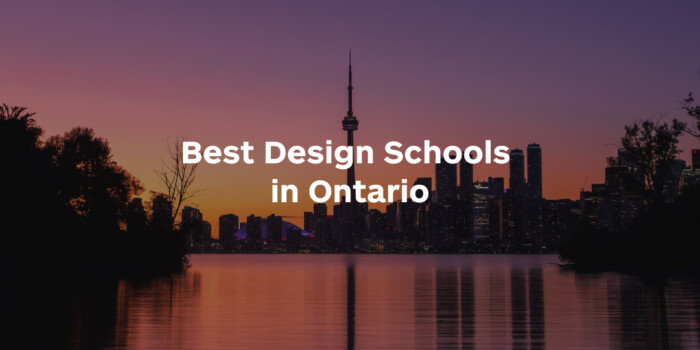
Looking to become a graphic designer in Ontario? The Heartland Province is a great place to study graphic design. As Canada’s...

Looking to make a career change at 50? It may seem like a daunting decision to make but it’s never too late to make the...
Looking to become a freelance graphic designer? At Shillington, with over 25 years experience, we know a thing or two about...
Graphic design is an ever expanding creative discipline. With our graphic design course, we teach you how to make research a...

Looking to make a creative career change at 40? There’s no time like now. It may seem like a daunting decision, but we’re...

Making a career change in your 30s can seem daunting, like really daunting. But we’re here to tell you, it’s not. As a...
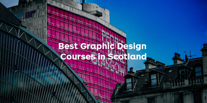
Looking to become a graphic designer in Edinburgh, Glasgow or elsewhere in Scotland? From its incredible urban...

Online Half scholarship recipient Val Miranda worked as a Compliance Officer at an international charity but grew tired of...
Want to win some amazing prizes and stay in the loop with all things Shillington? Sign up to our newsletter to automatically go in the draw.